Sunday, February 27, 2011

Mad About Hue: Lilac + Yellow

..totally smitten by the lovely shades of soft lilac and yellow!  There is a sophistication and delicacy about the palette that I simply adore.  Cate Blanchett walked the red carpet at the 83rd Academy Awards tonight in this stunning lilac Givenchy Haute Couture gown from the Spring 2011 collection.  While this lovely shade may hang in my closet, I have never been adventurous enough to consider the romantic hue for decor...have you?

Thursday, February 24, 2011

Cosmically Chic

5, 4, 3, 2, 1.....Today marks the final flight of NASA's space shuttle Discovery!  Inspired by the momentous occasion I bring you a cosmically chic vignette from Thomas O'Brien's New York apartment.  The 1940s star chart, pictured above, has been on my mind for quite some time.  It's such a clever piece of art - I love the large celestial scale of it, a 'discovery' in itself.  How great would this look in a bedroom?  I can't think of anything more perfect for a bedroom than a dark blue night sky.  I've searched ebay several times trying to find a dreamy, dark blue look-alike but have had little luck.  I did, however, find these lovely alternatives:   

Wednesday, February 23, 2011

Modern-Day Drapers

I'm having a major Dorothy Draper moment.  At last week's Revision Home sale I was so close to purchasing a vintage Draper-designed España Bunching Chest —I had my debit card ready then choked...now it's gone!  Sigh.  Since then, It seems like everywhere I look I see reminders of the chest and the famous American 20th century decorator.  And it's no wonder — Dorothy Draper is absolutely one of the most legendary American designers.  She is also the muse for many current designers.  Elements of her design at The Greenbrier Hotel, perhaps the pinnacle of her life's work, can be seen on the pages of almost any current design magazine.  Just this month Ruthie Sommers' Draper-esque pool pavillion graced the pages of House Beautiful.  Notice the signature Dorothy Draper striped walls and large botanical print on the chair.  Miles Redd is also heavily influence by her style.
 
The room below, designed by Miles and published in NYMag, is Miles meets Dorothy Draper's lovechild and I love it!  It could easily be mistaken for a room at The Greenbrier Hotel.  Note the geometric pattern floor, black paper shades, plant life, bold colors and modern-day floral alternative—ikat!
photo by Thomas Loof for New York Magazine
Want the Draper effect?  New York Magazine breaks down the look with The Elements of Draperism:
1. Intense color
2. Plant life
3. Dense, textured carpet
4. Striking details
5. A roaring fire
6. Exuberant prints
7. Big mirrors
8. Chessboard tiles
9. Statement wallpaper
10. Romantic furniture

Tuesday, February 22, 2011

Birthday Baggage: Céline Clutch

I really, really need one of these in my life, my actual well-being depends upon it.  My Birthday was two weeks ago and I'm still trying to figure out what to buy myself.  This Céline Clutch Pouch is definitely calling my name.  Céline, why do you taunt me?
This Clutch Pouch in Fluo Peach is my absolute favorite.  Sigh.

Images via STREETFSN

Monday, February 21, 2011

Smitten | Roberto Capucci

So pretty it deserves its own post.  While reading the March issue of Bazaar I came across this stunner.  If I lived in Philadelphia, you can bet I'd haul myself to the Philadelphia Museum of Art and seek design inspiration from the Roberto Capucci: Art into Fashion exhibit.  The exhibit celebrates the forward-thinking Italian fashion designer noted for his mastery of volume, liberation of color, and introduction of fashion as sculpture.  How striking are the layers and layers of pleats?  Smitten.

Glamorous + Girlie

The weather here in Chicago is miserable - rain, wind, and now possibly a little snow added to the mix. While most of my friends are off work for the holiday, I'm in the office and in serious need of a pick-me-up.  Leave it to the great Ruthie Sommers to get the job done.  Ruthie's glamorous and girlie foyer, filled with bright whites and sprinkled with pink and gold, is sweet enough to brighten anyone's day.
The icing on this beautiful foyer's cake?  The Jane Churchill Rossini fabric, available through Cowtan & Tout.

Hope you have a wonderful week!

Image via House Beautiful

Friday, February 18, 2011

Le Style Castaing: Leopard Carpet

I couldn’t agree more! I'm in the midst of reading The World of Madeleine Castaing and have decided that in 2011 I'm going to take note from the great French decorator and say yes to animal print! For Maison de Lèves, her dreamy Directoire-style country house, pictured above, Castaing selected an exquisite palette of turquoise, black, white, deep red and leopard!  In theory, leopard print wall-to-wall carpet might seem overpowering, but its small scale and restrained palette make for a surprisingly understated element. And the best part - It's as practical as it is pretty!  According to the author, Castaing used leopard print carpet throughout the house because it was good for disguising muddy footprints. 

Although Castaing died in 1992, many of her favorite rugs,manufactured by the French firm Catry Tapis, are still available for purchase through Stark.  Now my darling readers, do feast your eyes upon a selection of Madeleine's drool-worthy wild interiors....
Castaing greatly admired the taste of Napoleon's consort Josephine.  Napoleon and Josephine lived at Château de Compiègne and each had their own apartment which were renovated and furnished between 1807-1809. The leopard carpet here, in empress Josephine's dining room, to my mind proves that leopard was, is and always will be timeless.
Josephine's dining room served as inspiration for Madeleine's use of similar carpeting at Lèves and on her other projects. One of a pair of stools embroidered with Madeleine's initials, above, sits on top of Leopard carpet in the Salon de la Rontonda. 
Another view of the salon at Lèves, which Madeleine redecorated with a fabulous leopard carpet and her signature turquoise- such beautiful contrast!

Wednesday, February 16, 2011

Inspired Interior: J. Crew + Hans Hofmann

One thing I love about writing this blog is that I find myself making connections between the things I love.  When I read that Marissa Webb, head of J.Crew’s women’s design, chose painter Hans Hofmann as her inspiration for the spring collection I immediately envisioned a Hofmann-inspired interior.  When describing the pieces for the upcoming season she used the words “Colorful. Uplifting. Intense. Warmth.” 
This library/dining room comes to us from the London townhouse of Christine d'Ornano, cosmetics executive for Sisley.  I've adored this interior shot since first setting eyes on it.  Like the J. Crew collection, there's a perfect amount of whimsy (the framed butterflies and wire dog sculpture) combined with cheery Hofmann-like color on traditional pieces like the Louis XVI–style chairs and chesterfield sofa. The painting above the mantle is divine! I also really love the soft grey walls and the way they complement the room’s rich hues.  Most importantly, I could absolutely see myself entertaining in this room...could you?

Side Note: Have you heard the news?  Get your bookmarks ready - J. Crew is starting a BLOG!

Monday, February 14, 2011

J'adore Hervé Pierre

With stacks of iconic orange boxes, pretty perfume bottles, plastered angels and a curtain tieback made of a stuffed Balmain glove, the New York home of Carolina Herrera creative director Hervé Pierre has an utterly romantic sensibility I simply adore.  I love his attention to detail, his color palette and the fact that it's slightly cluttered yet still extremely elegant.  Pierre's NeoVersailles apartment feels like Paris in New York - and what's more romantic than Paris on Valentine's Day?
The plaster angel, which came from a Christmas window display at Lanvin in Paris, overlooks the living room.
The curtain tieback is a stuffed, mounted Balmain glove.
An artist's wooden hand model looks great perched near a collection of books about Christian Dior
I wish I had “I’ve worn an Hermès scarf since I was 15! Even in bed.” - Hervé Pierre
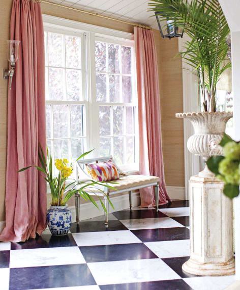
Extra-long pink curtains drape into flowy puddles on the floor - how dreamy!
The tea-service porcelain is from the Manufacture Nationale de Sèvres (posted about here) and is an exact replica of those made in the eighteenth century. The macarons are from Ladurée.
A bedroom fit for royalty - Pierre’s canopy bed is covered in 92 yards of fabric from Beckenstein, a gift from Carolina Herrera.
I'm in love with the color scheme and brilliant use of scale in the bathroom.  The green of the oversized perfume bottle looks beautiful against the Carrara marble walls.
Images by The Selby

Happy Valentine's Day!

Painting by Caitlin McGauley

Friday, February 11, 2011

Aerin Lauder's Devine Bedroom

The first time I was this picture of Aerin Lauder’s East Hampton master bedroom I just about died.  It's been one of my favorite rooms since being published in the December 2007 issue of House & Garden (and later, Elle Decor).  The Gramercy fabric on the walls and the bed is just "devine".  Michael Devine, that is.  If I could replicate this exact room in my home, I would.  It perfectly encompasses my layered, granny-chic aesthetic.  And those linens.  Although I love pattern, when it comes to bedding I tend to gravitate towards crisp, whiteness and no one, in my opinion, can dress a crisp, white bed quite like Leontine Linens.  Oh how I dream of being a Leontine Lady.  Mom, Paul, Birthday Fairy?  If your reading this, two euro shams with an oversized Maxwell monogram would make my 26th year of life a memorable one!  Add in a fur throw and I'd be one smitten kitten!

Thursday, February 10, 2011

Smitten | Decorative Jewels

As far back as I can remember, I've always wanted a vanity. This one from Steven Gambrel's Designer Visions showhouse is particularly stunning.  I love the idea of hanging your necklaces and jewelry on the walls as decoration - all you'd need is a box of shoulder hooks like this

Wednesday, February 9, 2011

Cool to be Classic: Céline + Netto

One of the greatest struggles of getting dressed this time of year is striking a balance between looking good and staying warm. The art of putting together chic, cool weather outfits is underrated. Leave it to Phoebe Philo at Céline to get it right. Miss Philo's 2010 pre-fall collection embodies winter-chic at its finest. Silk blouses, brightly colored wedges, high-waisted, wide-legged tailored trousers and smart uses of fur, who would have ever thought that classic minimalism of this type could once again look so fresh? This made me think, could lux-low key essentials and classic minimalism translate into an interior? The Answer is yes.
By now, we've all seen this iconic shot of David Netto's bedroom in his New York apartment.  The beauty of it, at least to me, is that it's so unexpected. There's that very traditional hand-blocked wallpaper mural by Zuber paired with that sleek chrome bed and Regency mechanical table.  Then there's the room's rather spare color scheme of blue, white, brown and a pop of orange.  This room is beautifully edited yet still seems livable and comfortable.  And just like the Céline collection,  it perfectly bridges the gap between traditional and modern.  With proof that classics are cool, lets all channel these looks as the last weeks of frigid temps loom, shall we?

Tuesday, February 8, 2011

Papered Powder Room

I am particularly fond of using wallpaper in small rooms or in awkward spaces. I love wallpaper in entryways, hallways, powder rooms, pantries, walk-in closets and installed into the backs of bookshelves. If you're like me and tire of pattern quickly, try installing wallpaper in these smaller, less visited areas of your home. There certainly are many papers to choose from but these days I'm particularly smitten with the traditional yet bold papers by Farrow & Ball. The picture above was taken by my long-distance design client living in Maine.  Today we are trying to chose a paper for their first floor powder room.  I think it's best to decide on a color palette and then pick a pattern. Right now I'm leaning towards Farrow & Ball's Ringwold Paper in yellow but I also love the simplicity of the two papers pictured below.  Which one do you prefer?

Monday, February 7, 2011

Pretty in Pink: Inés de la Fressange

While perusing The Selby archives last night I came across these photos of Inés de la Fressange and was instantly reminded how much I love the unabashedly feminine bright pink walls in her Paris home.  Painted in Sèveres pink, this rich rose-pink color, generally known as ''rose Pompadour,'' was created by the Royal porcelain company Manufacture Nationale de Sèvres in 1757.  Combined with Ikea sofas and knick-knacks galore, the office feels elegant but with a vital dash of the unexpected that gives a space character.  While an eclectic and unexpected mix, there isn’t anything overly flamboyant. She leaves the drama for her wall color and a few other choice accents.  Since this office proves pink can be sophisticated, I definitely see a pink room in my future! Enjoy!